High Contrast Colors for Visually Impaired Users
Pick high contrast colors for visually impaired users with confidence. Covers WCAG ratios, tested palettes, charts, and email-ready choices.
You've sent the renewal reminder, the deadline is correct, and the layout looked polished in the design file. Then a member opens it on a phone and sees gray text fading into a white background. They enlarge the message, increase screen brightness, and still have to guess which date matters.
That problem isn't a matter of taste. High contrast colors for visually impaired users help compensate for reduced contrast sensitivity, color-vision differences, glare, and the limitations of real screens and email clients. A palette can look elegant in a design review and fail when someone reads it at low brightness, on a glossy display, or through an email app that strips away part of the original styling.
Table of Contents
- Why Contrast Matters More Than Color Choice
- How WCAG Contrast Ratios Actually Work
- High Contrast Palettes That Hold Up in Real Use
- Designing Charts, Alerts, and Icons Beyond Text
- Testing and Validating Your Color Choices
- Quick Reference Checklist for Your Next Send
Why Contrast Matters More Than Color Choice
A reader with reduced contrast sensitivity may see letters blend into their background instead of forming crisp shapes. Fine details disappear first, particularly in thin fonts, muted labels, placeholder text, and copy placed over photographs. Enlarging the message or moving closer to the screen cannot restore information that lacks enough separation between light and dark areas.
Clinical research shows why this matters in practice. A 2024 study comparing visually impaired participants with controls reported mean log contrast sensitivity scores of 1.19 and 1.15 in the visually impaired group at 1.5 cycles per degree, compared with 1.908 and 1.93 in controls. The difference reflects how effectively people can perceive low-contrast information, not a preference for one brand color over another. The study is available through PubMed Central.
Contrast sensitivity is broader than color blindness
Color blindness usually describes difficulty distinguishing particular hues. Contrast sensitivity describes the ability to detect differences in lightness and edges. Someone may identify two objects as different colors yet still struggle to read text when their luminance values are too similar.
That distinction changes the design question. Ask, “How much luminance difference exists between this blue and the surface behind it?” rather than just, “Is this blue accessible?” Luminance contrast remains useful when hue discrimination is limited. It also supports readers affected by age-related visual changes or glare.
The same clinical literature reports that 9.1% of older adults had contrast sensitivity impairment in a 2025 study. Broader analyses cited there also indicate that poor contrast sensitivity affects about 1 in 10 U.S. adults over age 70. These figures are reported in the same PubMed Central research discussed above. High contrast is therefore a routine readability requirement, not an edge-case accommodation.
Practical rule: Choose colors by their measured lightness difference first, then use hue to express brand personality.
Contrast decisions also affect more than paragraph text. A chart may use colors that look distinct to a designer but merge for a reader. An icon, status badge, or alert can lose meaning when its color is the only signal. In email, the result depends on the client, screen brightness, image rendering, and whether the reader uses a dark or light interface.
Glare adds another trade-off. Pure white backgrounds with very dark text create strong separation, but the brightness may feel uncomfortable for some readers. Others need that separation to keep words from dissolving. The appropriate combination depends on the task, display, text size, and person using it.
WCAG therefore provides measurable thresholds rather than prescribing one universal palette. Contrast belongs to the relationship between foreground and background, not to an isolated color.
How WCAG Contrast Ratios Actually Work
WCAG expresses contrast as a ratio based on relative luminance, a measure of how light or dark a color appears after its color channels are converted into a standardized brightness value. The lighter color is compared with the darker color, producing a ratio from 1:1 to 21:1.
For standard text, WCAG 2.1 sets a minimum contrast ratio of 4.5:1. Large text can use 3:1, while WCAG's AAA level targets 7:1 for standard text. The WCAG 2.1 specification explains that 4.5:1 was selected to compensate for contrast sensitivity loss associated with moderately low visual acuity, color deficiencies, and aging. It also relates 4.5:1 roughly to vision loss equivalent to about 20/40 vision, while 7:1 addresses loss equivalent to about 20/80 vision.
Read the result, not just the pass label
A checker result of 4.3:1 fails the standard-text AA threshold. A result of 4.6:1 passes it. That small difference matters because the ratio is a defined minimum, not a general impression.
Use a checker in a repeatable sequence:
- Enter the exact foreground and background values, not approximate swatches.
- Check standard body text separately from large text.
- Test interactive components and important icons as non-text elements.
- Test the actual font weight, size, and surrounding background.
- Record the result so later palette changes do not undo it.
The calculation measures luminance, not hue. A saturated color isn't automatically readable, and two colors that look dramatically different on a color wheel may have insufficient luminance contrast. WCAG's contrast understanding document specifically cautions that chromatic contrast alone doesn't guarantee readability for people with low vision.
WCAG contrast requirements by element type
| Element Type | AA Minimum | AAA Minimum | Notes | |---|---:|---:|---| | Standard text | 4.5:1 | 7:1 | Use the stronger target for critical reading where practical | | Large text | 3:1 | 4.5:1 | The text must meet the applicable large-text definition | | Active UI components | 3:1 | No separate universal AAA target listed here | Test borders, fills, icons, and focus indicators in context | | Decorative or incidental content | Exempt in specified cases | Exempt in specified cases | Don't apply the exemption to meaningful information | | Logos | Exempt | Exempt | Brand treatment can still affect practical readability |
Links need context too. A message may contain technically passing text but still become difficult to work through if links blend into surrounding copy. For email structure and readable content choices, HTML versus text email offers a useful comparison.
Treat the ratios as a floor. Anti-aliasing softens letter edges, thin fonts carry less visual weight, and placeholder text often appears lighter than intended. If a pairing barely passes in a large specimen, it may be a poor choice for a small email footer or a compact form label.
High Contrast Palettes That Hold Up in Real Use
A campaign can pass a contrast checker and still become uncomfortable on a bright phone screen. Black text on white creates maximum separation, but some readers experience glare or halation, where bright backgrounds make dark letter edges appear to spread. A warmer or slightly tinted background may reduce discomfort without making text disappear, as long as the measured contrast remains strong.
Build a small palette library instead of choosing colors from scratch for every send. Test three or four foreground colors against two background tones, then assign approved combinations to roles such as body text, headings, links, buttons, and alerts. A muted gray that works for a large heading may fail in a compact email footer, so define its role before approving it.
Compare the common pairings
Pure black on white is a useful reference point. It provides the strongest light-dark separation and supports demanding reading tasks and readers who need pronounced edges. Bright displays can make it uncomfortable for some people, though, so treat it as a tested option rather than an automatic default.
Navy on cream can feel less harsh while preserving a strong luminance difference. A pairing such as #0B1F3A on #FFF8E7 gives newsletters and long-form messages a practical starting point. Measure the exact values in your chosen checker before shipping. Cream changes the visual character, not the need for testing.
Dark mode may help readers who are sensitive to bright backgrounds, particularly in dim environments. Inversion can create new problems when dark text, shadows, images, or low-brightness borders become hard to distinguish. Set up a deliberate dark theme with its own hierarchy. Swapping black and white does not guarantee that the design will remain readable.
Red and green should not carry status meaning by themselves. Their hues can collapse for people with red-green color-vision deficiencies, even when the luminance relationship appears acceptable. Deep orange on charcoal, such as #F28C28 on #202124, gives warning content a different hue and stronger visual identity. Pair it with a label, icon, or other cue.
| Foreground Hex | Background Hex | Contrast Ratio | Best For |
|---|---|---:|---|
| #000000 | #FFFFFF | 21:1 | Maximum text separation and demanding reading |
| #0B1F3A | #FFF8E7 | Verify before use | Softer-feeling body copy and newsletters |
| #FFFFFF | #202124 | Verify before use | Dark interfaces and low-light reading |
| #F28C28 | #202124 | Verify before use | Warning accents paired with labels or icons |
| #777777 | #FFFFFF | 4.48:1 | Borderline standard text, so choose a darker value |
| #B3B3B3 | #FFFFFF | 1.83:1 | Decorative use only, not meaningful text |
The final two rows expose a common production mistake. Light gray may look refined in a mockup, then become nearly invisible in an email client. Keep a quiet color for decoration or borders, not meaningful text, unless its actual contrast supports that role.
A 2025 study on color schemes for visual impairments found that higher contrast generally improved accessibility for people with color-vision impairments. A separate accessibility design study reported 87% positive readability ratings, 65% reporting low cognitive load, and a 40% increase in navigation efficiency for an accessible interface version. Those findings are summarized in the 2025 PubMed Central research on color schemes for visual impairments, but they do not support maximizing contrast in every context. The email client, display conditions, surrounding colors, and user testing still determine whether a palette works.
Designing Charts, Alerts, and Icons Beyond Text
A passing text ratio doesn't make a chart understandable. Non-text elements can meet a contrast threshold and still communicate nothing when two colors look alike, when an icon has no label, or when a status meaning depends entirely on red versus green.
Start with redundancy. Each important visual signal should have a second way to be identified.
Make data visualizations survive grayscale
A chart legend that uses two shades of green asks readers to distinguish hue and small differences in lightness. A more resilient legend combines color with line style, shape, direct labels, or patterns.
Use these choices together:
- Direct labels: Place the series name or value beside the data instead of forcing readers to move between the chart and legend.
- Line variation: Use solid, dashed, or dotted lines when multiple series may blend.
- Borders: Separate adjacent bars or pie slices with visible boundaries.
- Ordered hues: Use a deliberate light-to-dark sequence for ordered data rather than a rainbow palette.
- Patterns: Apply textures when color alone would leave categories ambiguous.
Pie charts deserve extra caution. Adjacent slices with similar luminance can merge, and a legend located far from the chart increases the memory burden. Borders, values, and direct labels usually help more than adding extra colors.
Give alerts and controls a second signal
A red border around an invalid field, red text beneath it, and a red error icon can collapse into one dense, hard-to-read block. Use a concise text message, a recognizable icon with a label, and a clear field association. The color should reinforce the error, not carry it.
Icon-only buttons create a similar problem. A tiny icon may have enough contrast in theory but lack enough visual mass to be recognized quickly. Give it an accessible name, preserve a visible focus state, and avoid using a color change as the only indication that the control is active.
| Element | Color Signal | Required Redundant Cue | |---|---|---| | Success status | Green | Check icon and text label | | Warning status | Amber or orange | Warning icon and action-oriented message | | Error state | Red | Error icon, field message, and programmatic association | | Information notice | Blue | Information icon and descriptive heading | | Chart series | Distinct hues | Direct labels, line styles, patterns, or borders | | Selected control | Accent color | Shape, border, fill, or persistent selected-state marker | | Link | Accent color | Underline or another clear distinction from body text |
A color-only interface can fail even when its colors pass individual checks. Massachusetts digital accessibility guidance on color emphasizes that color should supplement meaning, not serve as the only way to convey it. This matters in emails too, where a recipient may read content in plain text, with images blocked, or through a client that changes styling.
Testing and Validating Your Color Choices
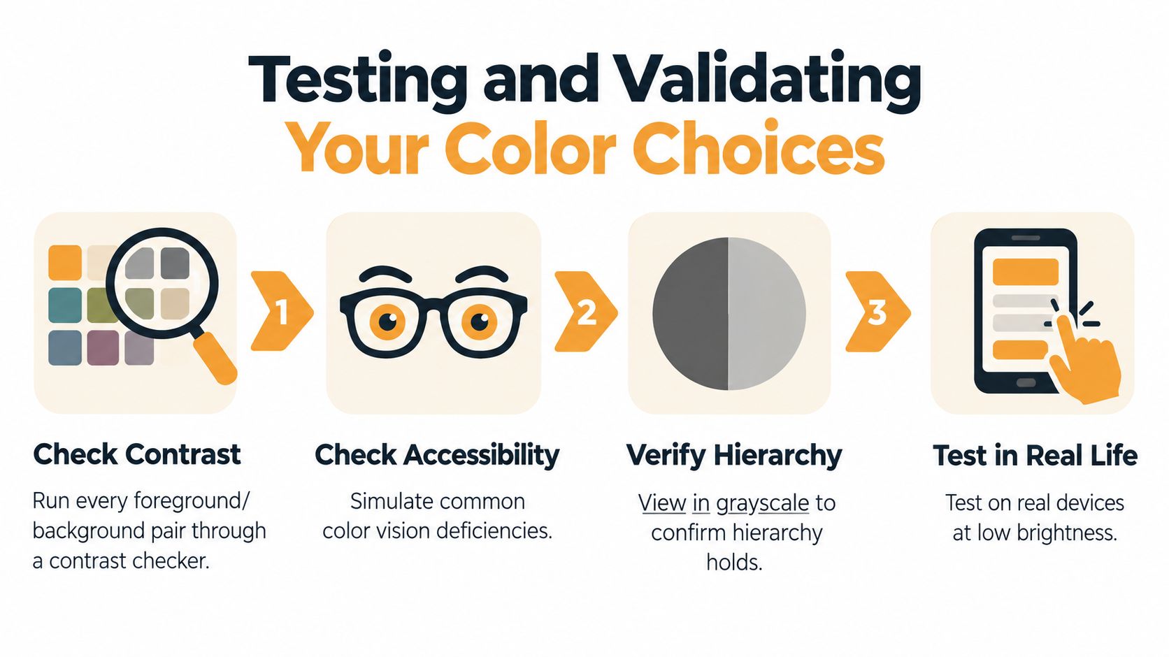
A contrast checker can confirm a ratio, but it cannot show whether someone can find a deadline, distinguish an enabled button, or interpret a chart after an email client changes the layout. Validate the design through several passes, with each pass targeting a different failure mode.
Use tools for different questions
- Run contrast checks. Use WebAIM's contrast checker or the Stark plugin to test each foreground and background pair. Record results separately for standard text, large text, and non-text components.
- Inspect forced colors. Open the interface in Windows High Contrast Mode, or test
forced-colors: activein a browser. Check whether focus indicators, errors, selected states, and chart meaning remain visible. - Review grayscale. Remove hue from the design. If the primary and disabled buttons look alike, color was carrying too much meaning.
- Simulate color-vision differences. Use Coblis or Sim Daltonism, particularly for red-green status systems and charts with multiple series.
- Use a screen reader. Test with NVDA or VoiceOver. Instructions such as “click the red button” fail when the listener cannot identify controls through color.
- Test real devices. Check a small phone, a large monitor, and a display at low brightness. Open the actual email clients your audience uses, rather than relying on the design application.
What automation misses: A ratio can pass while thin typography, crowded charts, vague labels, or weak focus states still prevent the task.
OS-level high-contrast modes provide useful diagnostics, but they do not replace authored contrast. Research on accessibility and high-contrast modes has found that system-wide settings can affect aesthetics and functionality, while ratios calculated for trichromatic observers may not describe the experience of people with color-vision deficiencies. Use the mode to expose failures, then correct the design itself.
Email introduces another layer of variation. A client may remove background images, alter dark-mode colors, suppress styles, or show a plain-text alternative. Test the message in the clients recipients open. The deadline, action, and status should remain understandable across those renderings, without depending on one color treatment.
Finish with a task-based review, not only a screenshot check. Ask someone to find the renewal date, locate the action button, identify the error, or explain the chart under realistic viewing conditions. If they need a designer's explanation, the interface has not communicated clearly enough.
Quick Reference Checklist for Your Next Send
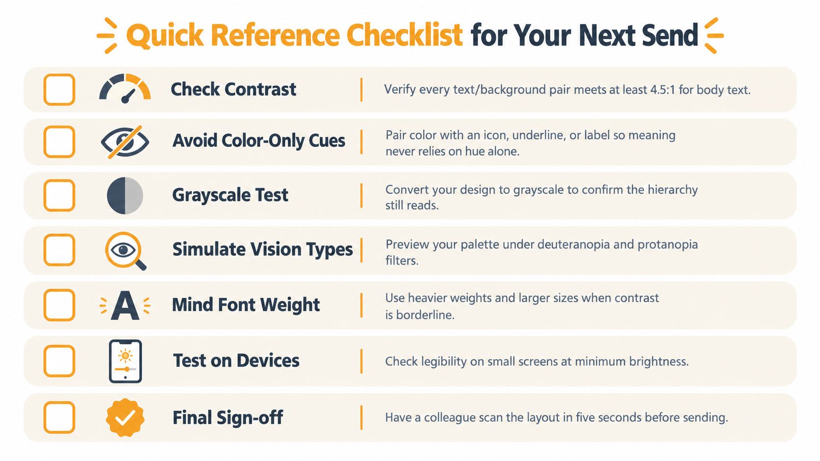
Use this list before publishing an email, form, dashboard, or community announcement. It's short enough for a send checklist and specific enough to catch the failures that visual polish often hides.
- Check body text: Verify that standard text reaches at least 4.5:1, using the WCAG 2.2 contrast guidance for the applicable element and context.
- Check large text and controls: Confirm that large text and active non-text interface components meet the relevant 3:1 threshold.
- Avoid color-only cues: Pair status colors with an icon, underline, pattern, shape, or plain-language label.
- Strengthen charts: Use direct labels, borders, ordered hues, and varied line styles so the data still makes sense without hue.
- Review typography: Replace thin, borderline text with a heavier weight, larger size, or stronger contrast.
- Test forced colors: Render the design with the operating system's high-contrast treatment and confirm that hierarchy and focus remain visible.
- Run a grayscale check: Make sure readers can distinguish primary, secondary, disabled, selected, and error states without color.
- Test vision simulations: Preview red-green and other color-vision conditions with a tool such as Coblis or Sim Daltonism.
- Make links obvious: Underline links or give them another persistent distinction from surrounding body copy.
- Protect focus visibility: Ensure the focus indicator is clearly visible against the surface behind it.
- Describe meaning in alt text: Explain what an image communicates, not merely which colors appear in it.
- Test actual clients: Open the email in the clients your audience uses, including the clients that handle dark mode and style overrides differently.
- Ask for a fast human review: Have someone locate the deadline, action, and key status without a design briefing.
Accessibility becomes easier when it's part of the default workflow instead of a final compliance pass. For organizers who need readable group announcements without asking every member to learn a new platform, group communication tools can keep participation within familiar email clients. Listava is one option that sends group messages through a shared email address and includes large-font, high-contrast considerations for its interface.
Listava helps organizers send messages to a group through one shared email address, with privacy controls and participation through standard clients such as Gmail and Outlook. If your next announcement needs readable, high-contrast communication without requiring members to create accounts or install an app, visit Listava to see how it works.