Email Accessibility Guidelines for Group Lists
Practical email accessibility guidelines for group lists, covering readability, contrast, alt text, structure, and a checklist organizers can follow today.
A board secretary sends the neighborhood meeting announcement from Gmail. The time and location sit inside a photograph, the caption uses pale gray text, and the message looks fine on the secretary's screen. One member receives only a blank image because images are blocked. Another enlarges the message and loses the end of every line. A third replies to one person instead of the whole group, so the updated parking instructions never reach everyone.
Nothing in the email announces that it has failed. The sender sees a successful delivery, while several members miss the information. Email accessibility guidelines are therefore about delivery and comprehension, not just design or compliance. A readable, predictable message gives more people a fair chance to understand, respond, and stay involved, whether they use Gmail, Outlook, a phone, a screen reader, or an older laptop.
Table of Contents
- The Message That Never Reached Half the Group
- What Email Accessibility Means for Group Messages
- Readability, Contrast, and Typography
- Alt Text, Headings, and Semantic Structure
- Reply Behavior, Subject Lines, and Thread Hygiene
- Choosing the Right Format for Your Group
- The Organizer's Pre-Send Checklist
- Building an Accessible Habit, Not a One-Time Audit
The Message That Never Reached Half the Group
The missed meeting illustrates a common problem in HOA, club, and volunteer communication. The organizer may have made a careful announcement, yet the message depended on conditions the organizer couldn't control: images had to load, the recipient had to distinguish low-contrast text, the email client had to preserve the layout, and the member had to know whether replying would reach the group.
Accessibility failures rarely look dramatic. A member may decide that the message wasn't relevant, give up while zooming, or ask another person to explain an attachment. Someone using a screen reader may hear a sequence of image filenames and table cells instead of the date, location, and required action. Someone reading in a second language may struggle with a long paragraph that contains several instructions without headings or spacing.

Accessibility is part of reliable group communication
For an organizer, the practical question isn't, “Does this email look polished?” It's, “Can every member find the important information and act on it without guessing?”
That means putting the meeting details in live text, using a subject line that describes the purpose, making links understandable outside their surrounding sentence, and deciding whether a reply should go to one person or the entire list. It also means avoiding a process that requires every member to create an account, install an app, or use a complicated portal.
Practical rule: If a member can understand the message with images turned off and text enlarged, you've already removed several common barriers.
The rest of these email accessibility guidelines turn that rule into ordinary habits for Gmail, Outlook, Yahoo, and mobile email. You don't need a design team to begin. You need a dependable structure that survives different screens, settings, abilities, and levels of technical confidence.
What Email Accessibility Means for Group Messages
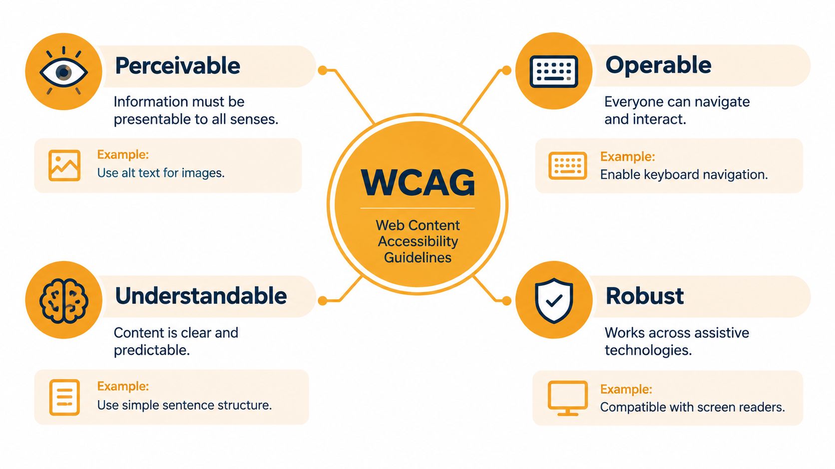
A monthly club update can look fine to its sender and still exclude members who enlarge text, use a screen reader, translate messages, or open email on a phone. Accessibility gives every person a workable path to the information and the requested action. For ordinary group messages, that path includes plain-text structure, a clear subject, predictable replies, and member onboarding, alongside contrast, alt text, and readable HTML.
The Web Content Accessibility Guidelines, or WCAG, provide a useful framework. WCAG organizes accessibility around four principles: Perceivable, Operable, Understandable, and Strong. Although written for web content, these principles also apply to HTML email with images, headings, links, buttons, forms, and structured layouts.
Ask four questions before sending:
- Perceivable: Can members get the information through sight, sound, enlarged text, or assistive technology? A meeting time placed only inside an image cannot meet this test.
- Operable: Can members reach and activate links without precise mouse movements? Links should be visible, tappable, and usable with keyboard controls when the email client supports them.
- Understandable: Can readers quickly identify the message's purpose and their next action? A descriptive subject, short paragraphs, plain instructions, and consistent reply behavior reduce guesswork.
- Strong across settings: Does the message keep its meaning across email clients, devices, image settings, and screen readers? Live text, descriptive alternatives, and sensible fallbacks help preserve it.
A practical target for community groups
WCAG defines three conformance levels, A, AA, and AAA. For a volunteer-run group, Levels A and AA offer a practical benchmark without turning each announcement into a software project.
Accessibility also supports people who do not identify as disabled. A member might read outdoors in bright sunlight, use enlarged text, experience age-related vision changes, rely on translation tools, or feel uncertain about email. Clear structure helps each person participate.
The U.S. Department of Justice describes WCAG as the technical foundation for a rule concerning accessible web content for state and local governments. Its web accessibility guidance highlights text alternatives, clear form instructions, and keyboard access, reinforcing that organizers should include accessibility when creating or changing content, not only after a complaint.
Readability, Contrast, and Typography
A message can't help a member who can't read it. Tiny gray copy, decorative type, and text placed over a photograph may look stylish in a design preview, but they become difficult to use on a small phone, in bright light, or after an email client changes the rendering.
WCAG 1.4.3, Contrast Minimum, makes this testable. Normal-sized text should have a contrast ratio of at least 4.5:1, while large text should have a ratio of at least 3:1, according to the WCAG-based email accessibility guidance. These ratios aren't aesthetic preferences. They help readers distinguish foreground text from its background.
Use live text on a solid background
Before sending, replace light-gray body text with a darker color and place it on a plain background. Don't put essential instructions over a photograph, even if the image has a dark overlay. If your group uses a colored label such as “Deadline,” add words such as Action required instead of making color carry the meaning by itself.
A free contrast checker takes little time and is especially useful when a template uses branded colors. Test the fallback colors too, because Gmail, Outlook, mobile apps, and dark mode may not preserve every intended style. High-contrast color guidance for visually impaired readers can help organizers choose safer combinations.
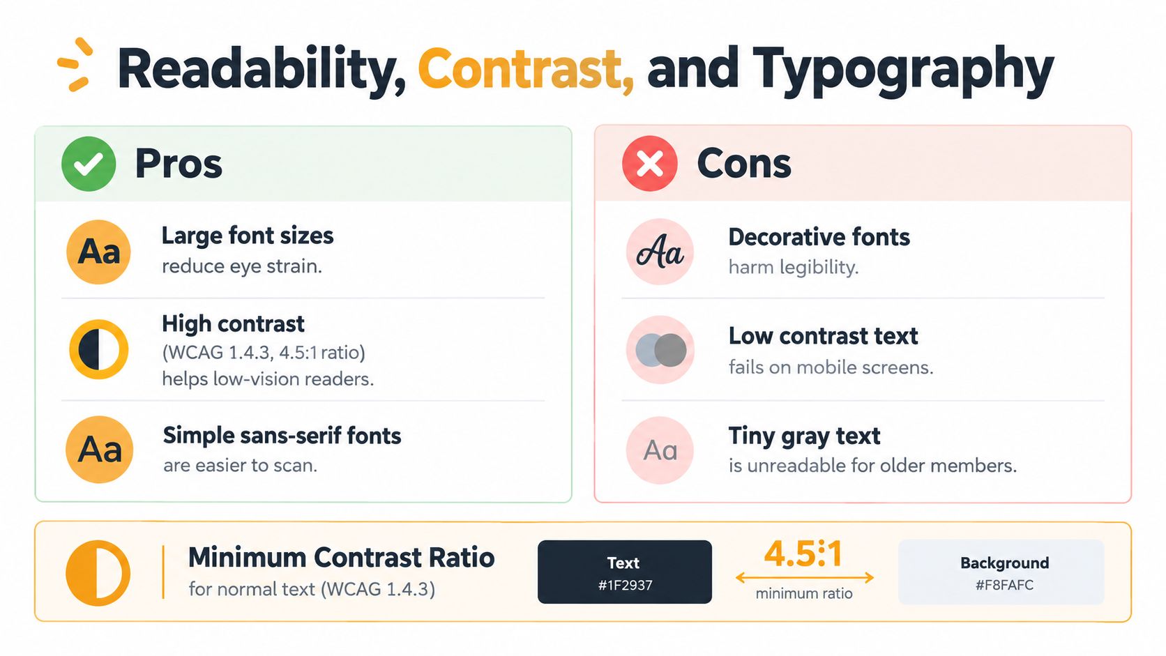
Choose a familiar, readable font and give paragraphs breathing room. Left-aligned text is easier to scan than tightly justified copy, and short paragraphs are kinder to members reading on phones or using a screen reader.
WCAG 1.4.4 also addresses 200% text resizing, helping people with low vision enlarge content without losing information or functionality. In practical terms, don't lock important information into a fixed image or a rigid layout that breaks when text grows. If an announcement still works after enlargement, members can adjust their devices without asking the organizer for a special version.
Alt Text, Headings, and Semantic Structure
Images should support the message, not carry it alone. If a flyer contains the only copy of the event date, location, and registration instruction, a member who has images blocked may receive no useful information at all.
Put the essential details in live HTML text or ordinary plain text:
Neighborhood cleanup
Saturday morning
Meet at the community entrance
Reply to this message if you can bring gloves
Then use alt text to explain the purpose of a meaningful image. “Photo of volunteers planting flowers beside the library” is useful when the image adds context. A decorative divider, logo treatment, or background shape can use empty alt text so assistive technology skips it. Don't repeat a caption word for word when the surrounding text already communicates the same point.
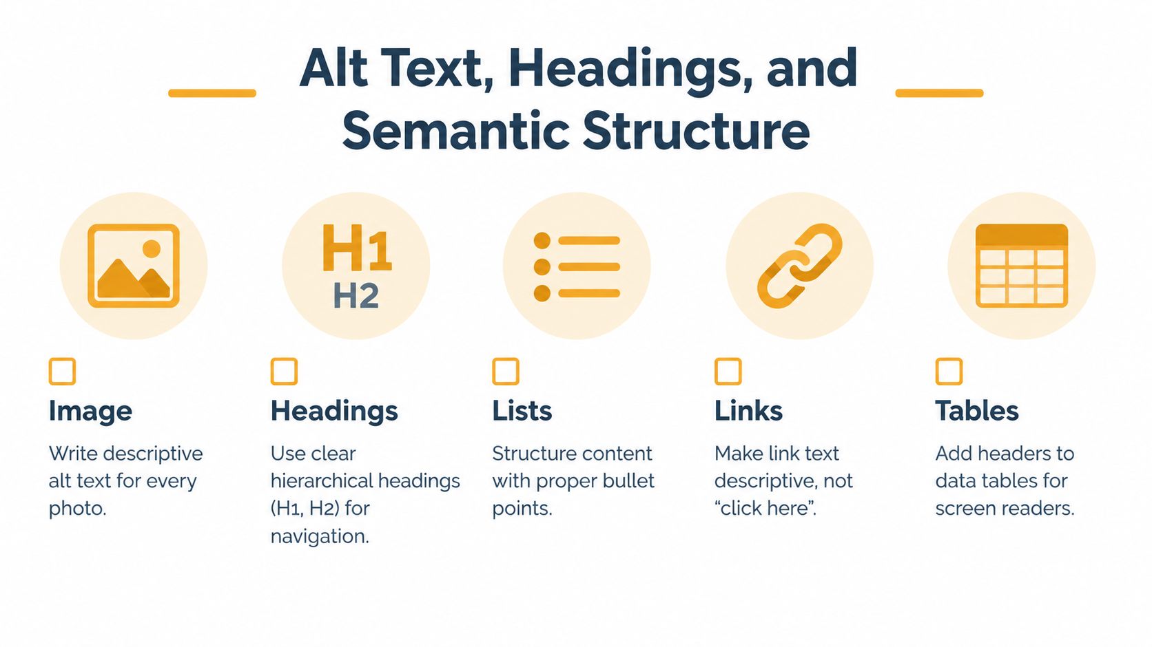
Give the message a navigable shape
Headings, lists, and descriptive links help a member skim visually and help assistive technology users move through the message. In a simple Gmail email, you may not create formal HTML headings, but you can still make the structure obvious:
- Meeting date: Saturday, May 10
- Location: Clubhouse room
- Bring: Your membership form
- Reply by: Thursday afternoon
Write “Download the accessible parking map” instead of “click here.” A screen reader user may move through content by links alone, so the link text needs to make sense without the surrounding paragraph.
Designed HTML messages need an extra structural precaution. Harvard's email best-practice material recommends applying role="presentation" to layout tables so screen readers don't announce rows and cells as though they were data. Data tables are different. If a table contains schedules or comparisons, preserve meaningful headers and relationships.
A well-structured plain-text message is often the safest format a volunteer can create. It avoids many layout problems, keeps the important content visible when images are blocked, and gives screen readers a cleaner reading order.
Reply Behavior, Subject Lines, and Thread Hygiene
A group email can be visually accessible and still be operationally confusing. Members need to know who will receive a reply, which message they are answering, and whether an attachment is safe to open with their software.
Start with the subject line. Use a predictable prefix and a specific purpose:
- HOA meeting, agenda for May
- Book club, location change
- Volunteer request, food table
- Action required, membership renewal
A useful subject tells a member whether to open the message, search for it later, or act immediately. Avoid changing the subject for every reply unless the topic changes. Consistent wording helps people using search, screen readers, and translation tools follow a conversation.
Make replies predictable
Decide what should happen before you send the first message. A logistical announcement may need replies to the organizer, while a discussion about shared arrangements may need replies to the group. Explain the choice in the message, especially if members may use Gmail and Outlook differently.
Keep quoted text short. Trim old signatures, repeated disclaimers, and long chains before adding a new update. Put the new information near the top, and identify the decision clearly:
Decision needed: Please reply to the group by Thursday if the proposed date doesn't work.
Attachments need the same care as the email body. Name a file descriptively, such as May-meeting-agenda.pdf, and summarize its purpose in the message. If the file contains a scanned image, a chart without text alternatives, or a form that can't be completed with a keyboard, offer the essential information in the email or provide another usable format.
Language is part of continuity too. Keep sentences direct, identify a language change, and avoid unexplained local abbreviations. The guide to keeping email threads usable offers a useful reminder that a conversation should remain understandable after several people have replied, not only when the organizer first presses Send.
Choosing the Right Format for Your Group
The simplest format often creates the fewest barriers. Plain text removes dependence on images, styling, and fragile layouts, but it still needs a meaningful subject, readable spacing, descriptive URLs or link labels, and clear instructions. Lightly formatted HTML can improve scanning when it uses live text, strong contrast, real lists, and restrained layout.
Designed HTML has a place for recurring newsletters, event campaigns, and organizations with someone who can maintain templates. It also creates more ways to fail, including inaccessible buttons, image-only announcements, layout tables read as content, and colors that disappear in a recipient's client.
| Format | Accessibility strength | Common failure mode | Best fit for | |---|---|---|---| | Plain text | Works across clients and keeps information visible | Dense paragraphs, unclear links, and missing spacing | Fast announcements, small volunteer groups, sensitive updates | | Light HTML | Supports headings, lists, live links, and visual grouping | Poor contrast or inconsistent rendering | Regular club and association messages | | Designed HTML | Can provide a consistent branded structure | Image-dependent content, complex code, and fragile fallbacks | Managed campaigns with template testing |
Use this comparison of HTML and text email when your group is deciding whether added design helps members. The decision rule is straightforward: choose the least complex format that lets members perceive the content, understand the action, and reply correctly.
Listava is one email-based option for groups that want a shared address, group-wide replies, privacy controls that hide member addresses, and participation through standard clients such as Gmail or Outlook. Its stated accessibility approach includes large fonts and high-contrast design, but organizers should still write clear messages and provide usable attachments.
The Organizer's Pre-Send Checklist
Use this checklist before an HOA notice, club reminder, or volunteer request. It works in Gmail, Outlook, and other ordinary email clients.
Subject and recipients
- Name the purpose: Write a subject that identifies the group topic and required action.
- Check the audience: Confirm that every intended member is included and that private addresses aren't exposed.
- Set the reply path: Decide whether replies should reach the sender or the entire group, then say so if confusion is likely.
Message content
- Put essentials in text: Include the date, time, location, deadline, and action in live text.
- Break up instructions: Use short paragraphs, labels, and lists rather than one dense block.
- Describe links: Make the link text explain its destination, such as “Read the revised parking policy.”
- Use plain language: Remove jargon, unexplained abbreviations, and instructions that require guesswork.
Visual and technical checks
- Inspect contrast: Confirm that normal text reaches 4.5:1 and large text reaches 3:1, using the WCAG email reference.
- Check images: Add useful alt text to meaningful images and empty alt text to decorative ones.
- Test enlargement: Increase the text size and confirm that no important content disappears or becomes unusable.
- Review the attachment: Use a descriptive filename and explain its purpose in the email.
Final human test
Send a test to yourself. Turn off image loading, open it on a phone, enlarge the text, follow every link, and read it aloud. If possible, ask someone who uses a screen reader to check the message occasionally, not because every organizer must become a tester, but because real feedback reveals barriers that a visual preview misses.
Building an Accessible Habit, Not a One-Time Audit
Return to the secretary's meeting notice. The fix wasn't a costly redesign. The organizer could place the time and location in text, replace the gray copy with readable contrast, use a descriptive subject, state the reply behavior, and attach a usable agenda. Those choices would help members with vision limitations, members on mobile devices, and members who need to find the information quickly.
A durable process matters more than a perfect one-off message. Choose a default format, keep a subject-line convention, use live text for essential details, and test any new template before making it the group's standard. Document the routine so the next board secretary or club coordinator doesn't have to reconstruct it from an old inbox.
Keep the habit small enough to survive turnover
- Use one dependable structure: Members learn where to find the date, action, and reply instruction.
- Review colors when templates change: A new logo or background can reduce contrast.
- Check with assistive technology periodically: A screen reader test with NVDA, VoiceOver, or JAWS can expose reading-order problems.
- Protect continuity: Keep the group process independent of one volunteer's personal inbox.
- Invite correction: If a member reports a barrier, fix the workflow and record the change.
The 2026 Email Markup Consortium analysis found serious or critical accessibility defects in 99.88% of 376,348 analyzed emails, with only eight messages passing its relevant checks, as reported in its accessibility analysis. That finding concerns analyzed email markup, not ordinary group messages as a whole, but it supports a practical conclusion: don't assume a message is accessible because it looks acceptable in one inbox.
Accessibility grows from repeated, ordinary decisions. A clear subject, readable text, predictable replies, private delivery, and an attachment that people can use will do more for a neighborhood list than decorative code that only works in one preview.
Listava helps organizers create a shared email address that reaches the whole group, supports group replies, protects member addresses, and works through familiar clients such as Gmail and Outlook. If your HOA, club, faith community, or volunteer team needs a simpler way to keep conversations private and continuous, visit Listava and review how its email-only approach can support your accessibility habits.